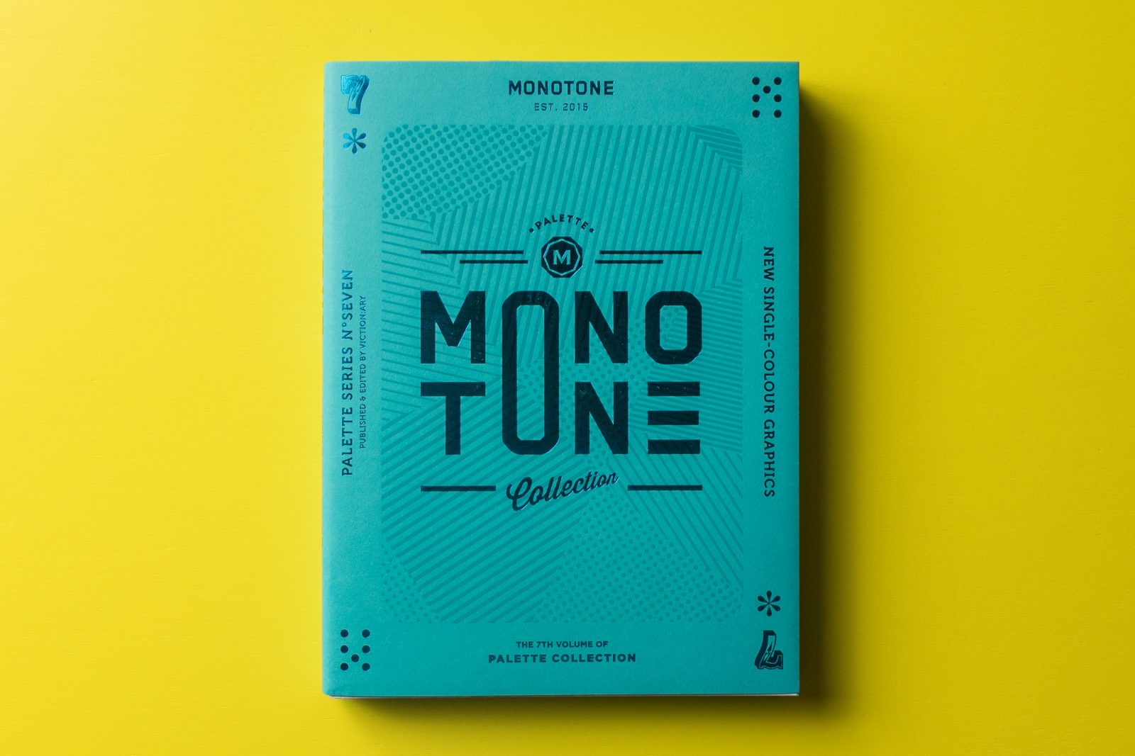
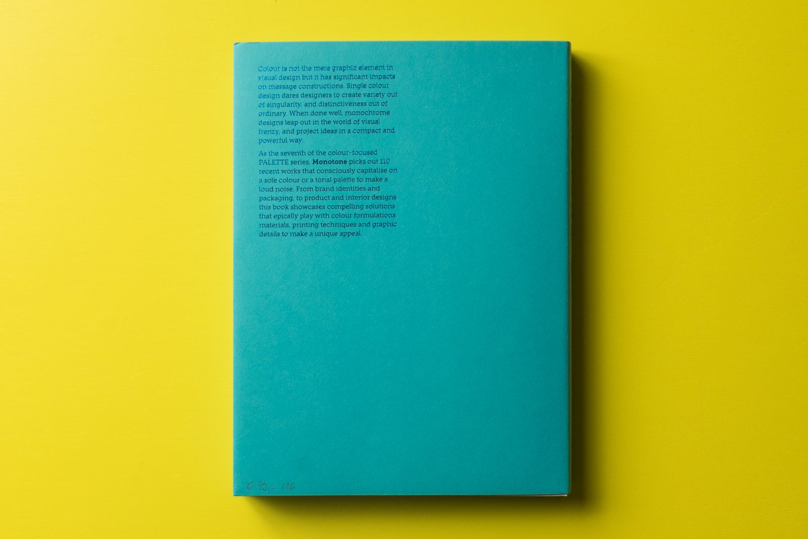
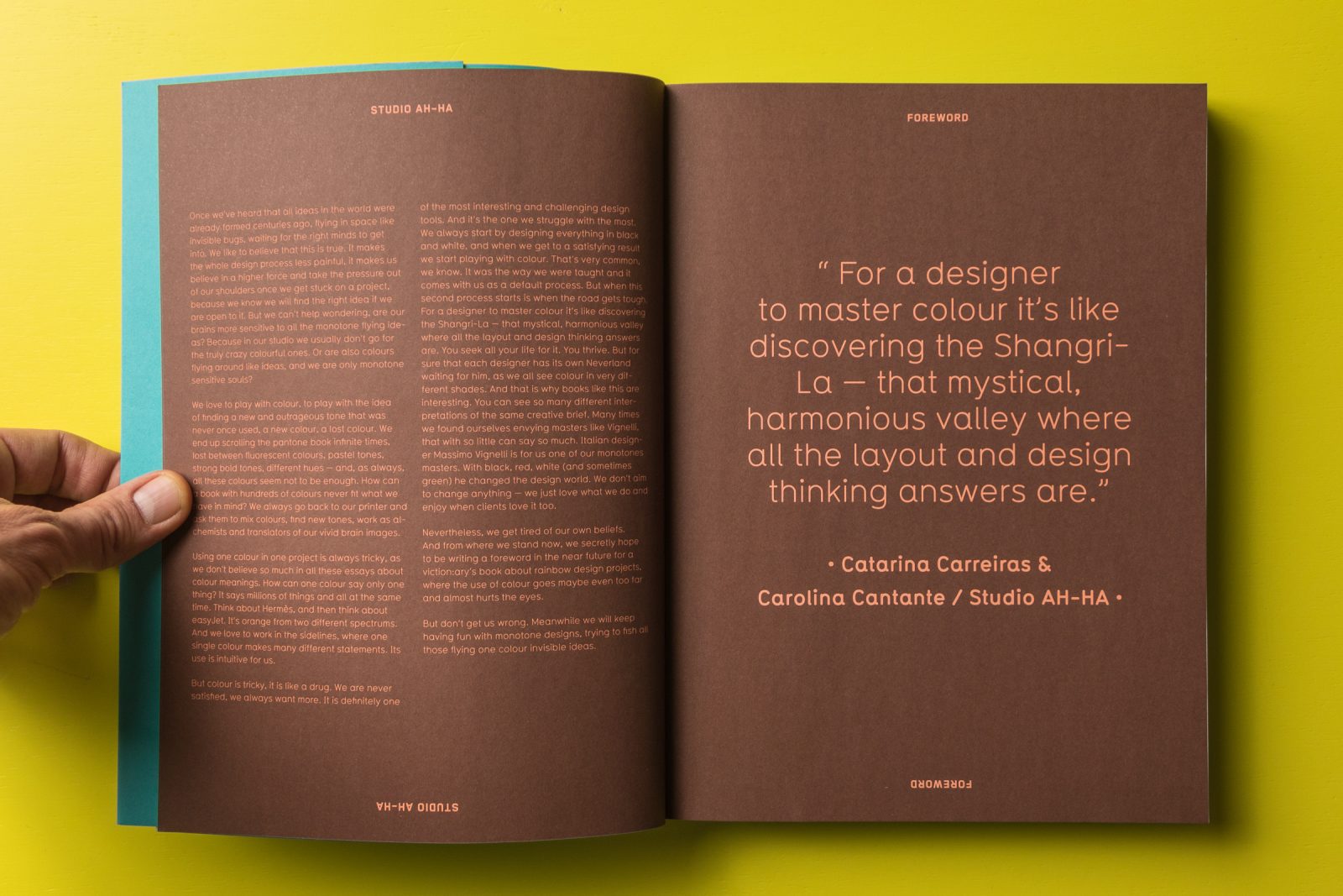
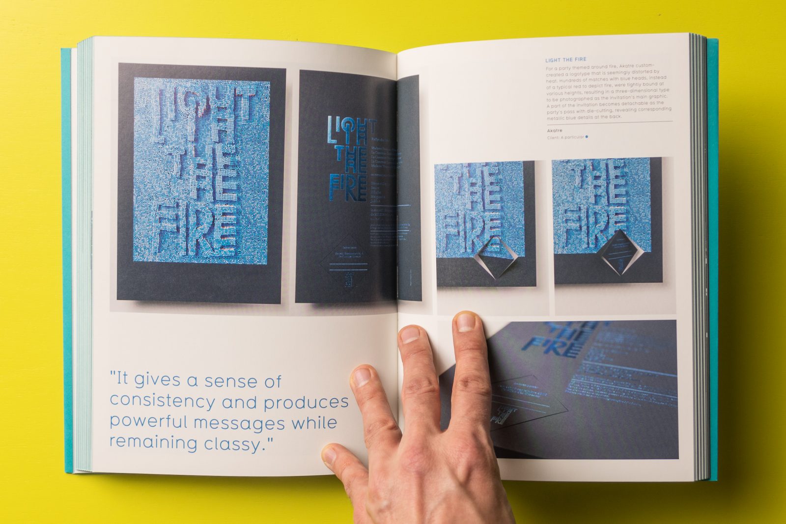
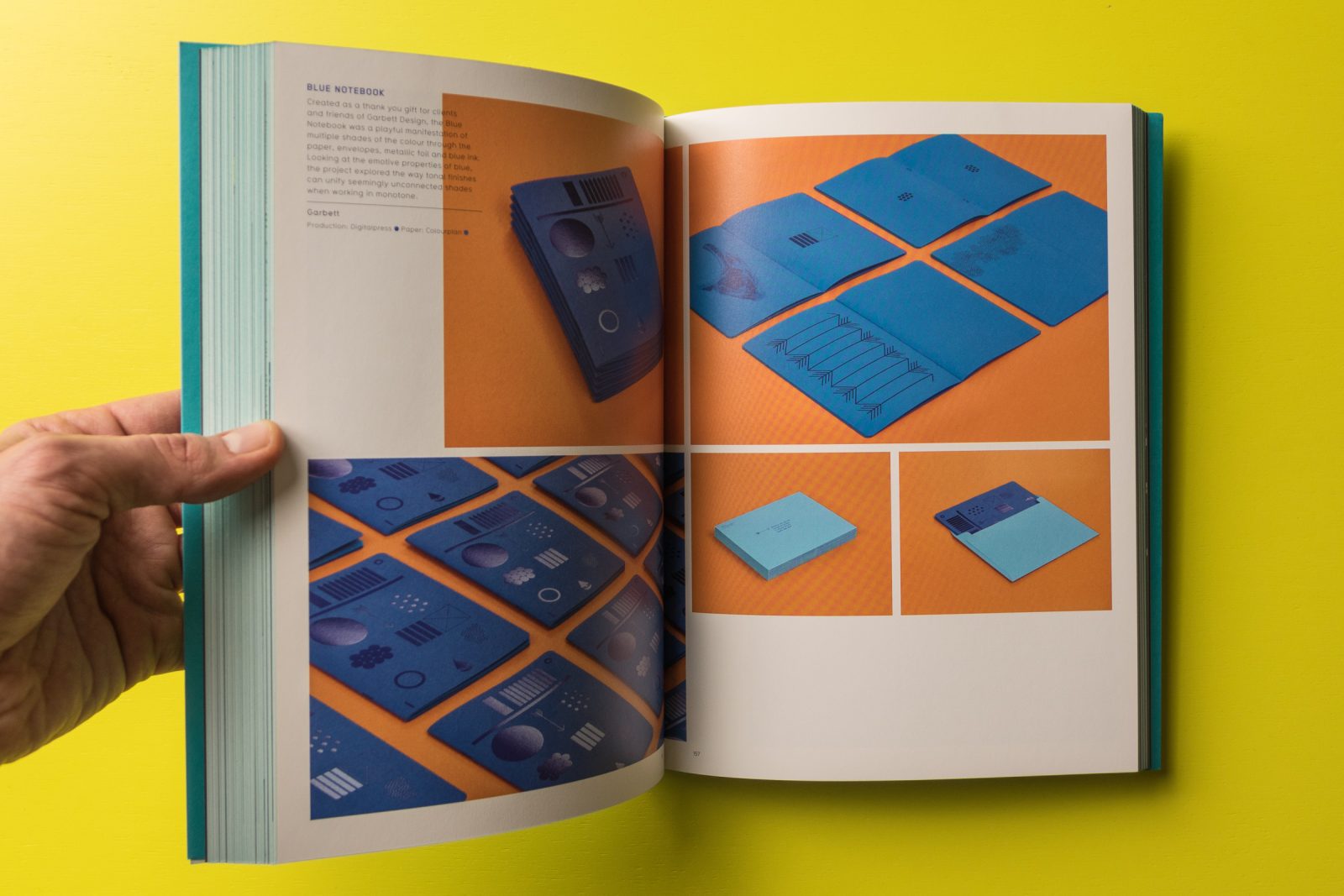
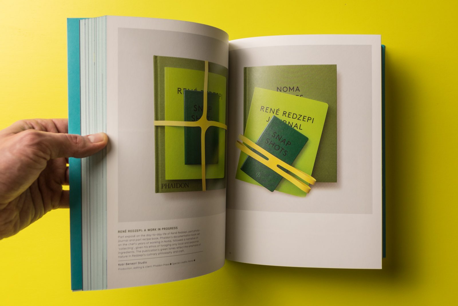
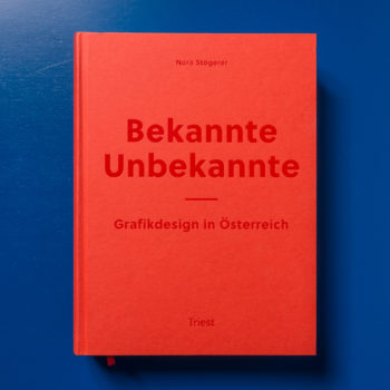
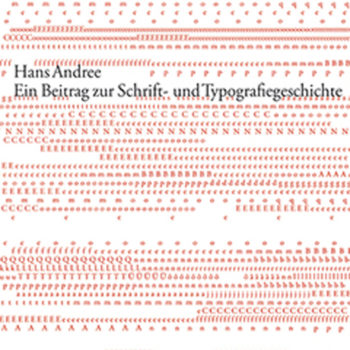
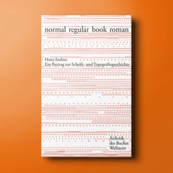
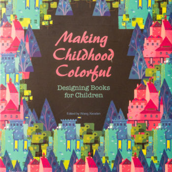
It is a difficult brief to create a design utilizing only a single color, one that relies heavily on a designers skill at composition and use of materials and special effects. While some leap at the challenge to create a noteworthy impact with the least amount of noise, relying on the basics of good design to complement the color choice, others face budgetary constraints and must elicit the best possible outcome from limited resources. For some this is achieved by creative use of negative space, for others through the transformation of graphics, logos and type through printing processes such as: debossing/embossing, foil stamping and spot varnishing.
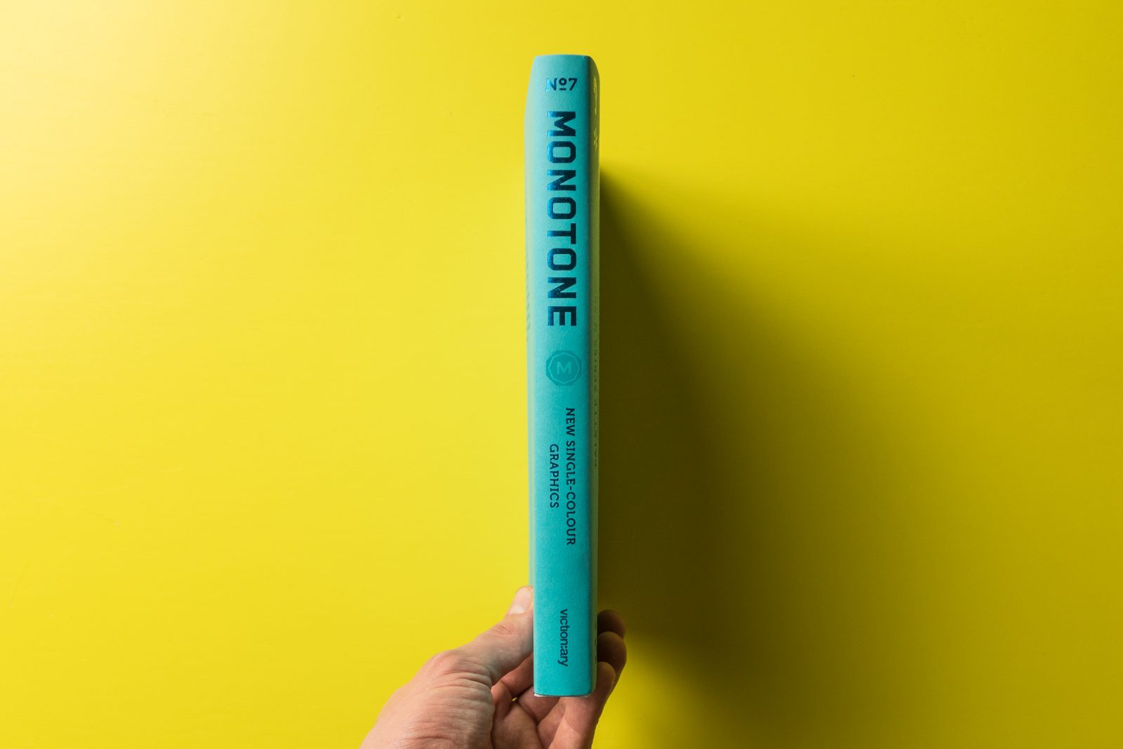
This latest volume in the bestselling Palette series from Victionary exhibits the most striking examples of recent years.

