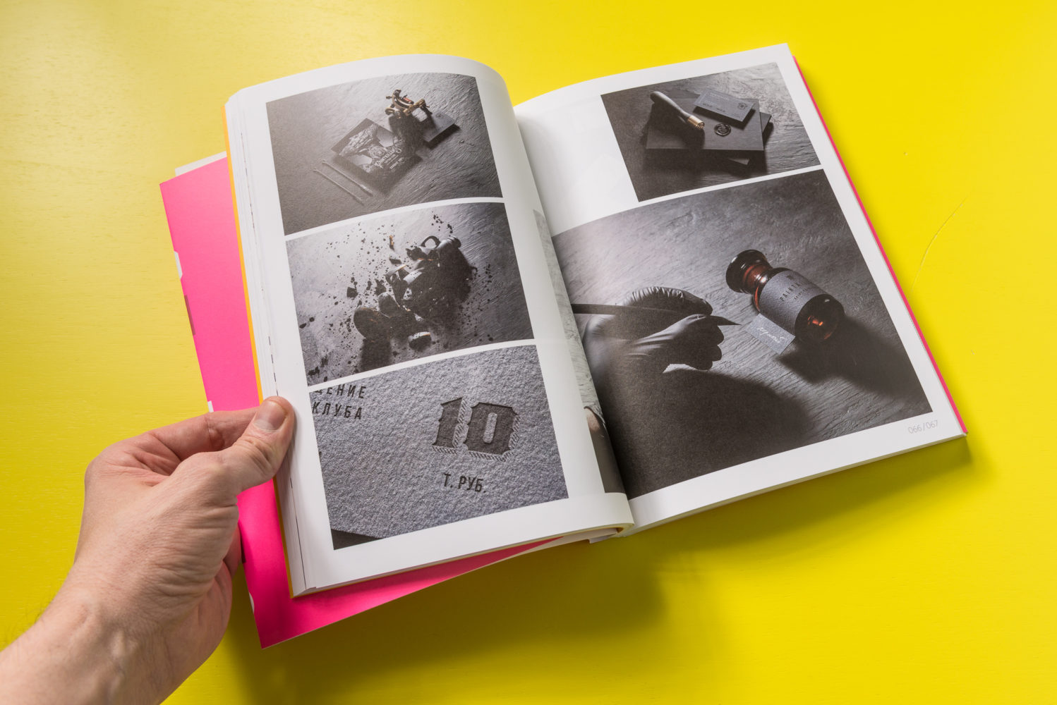
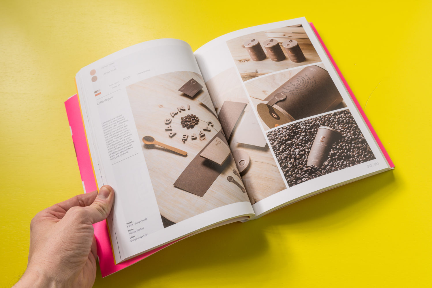
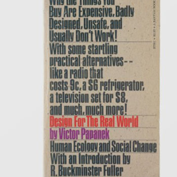
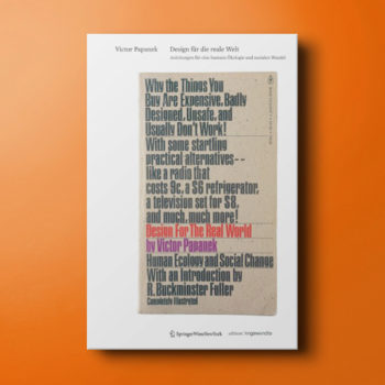
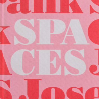
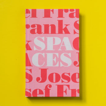
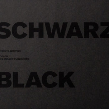
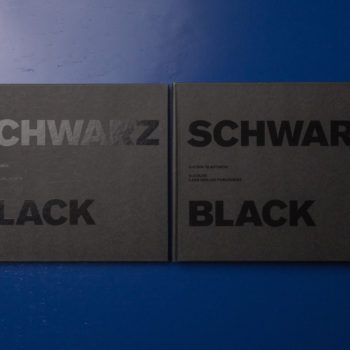
Artists have long explored the nuances of limited color palettes in their work, from El Lissitzkys highly symbolic abstractions to Shepard Faireys iconic Hope poster. Recognizing the power of simplicity in conveying a succinct message without too much noise or artifice instantly changes the way we interact with these compositions, and allows for the subtle use of texture, form and layer to create interest and convey information in unique and innovative ways.
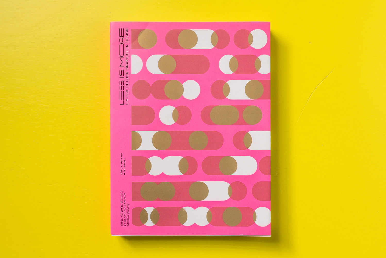
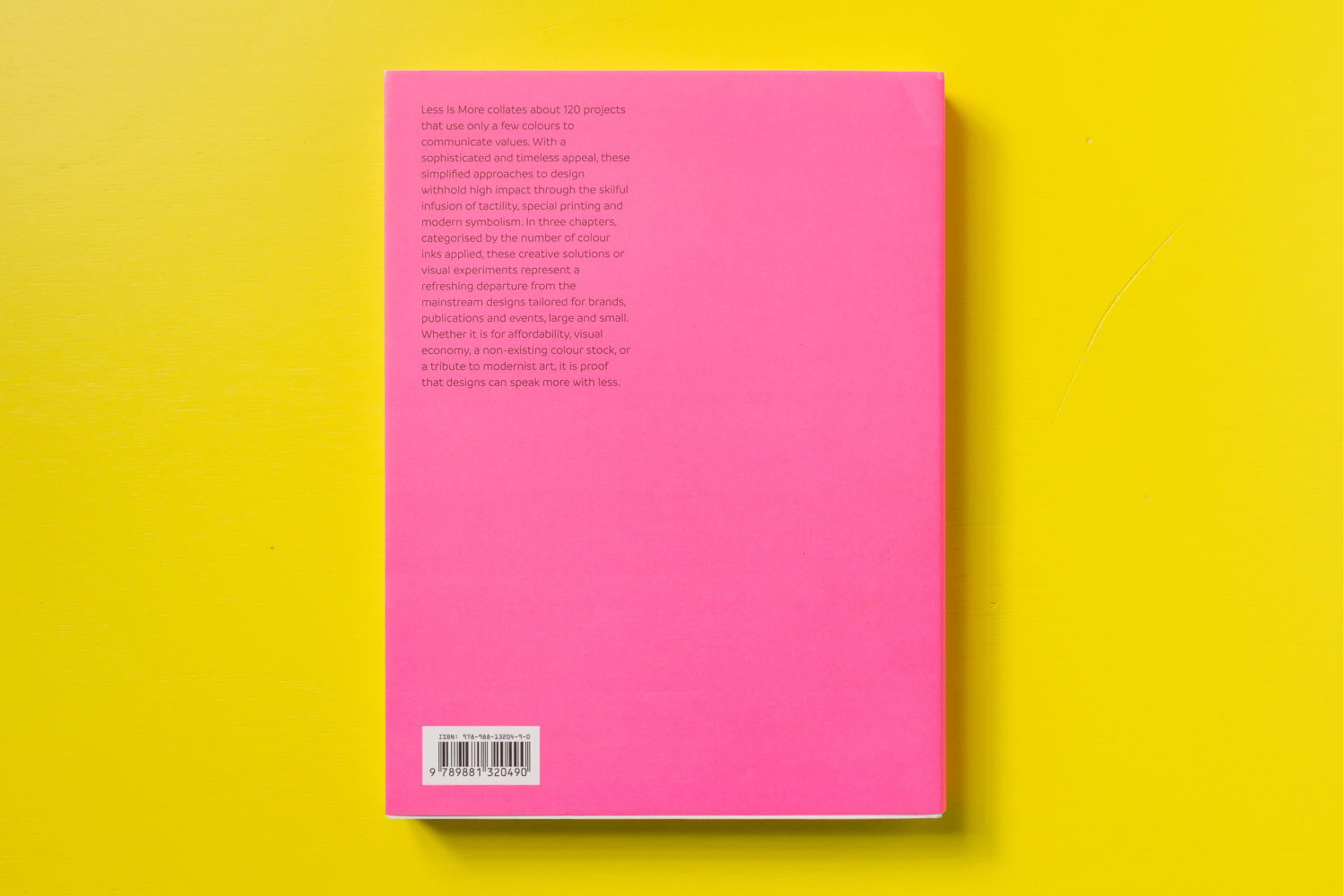
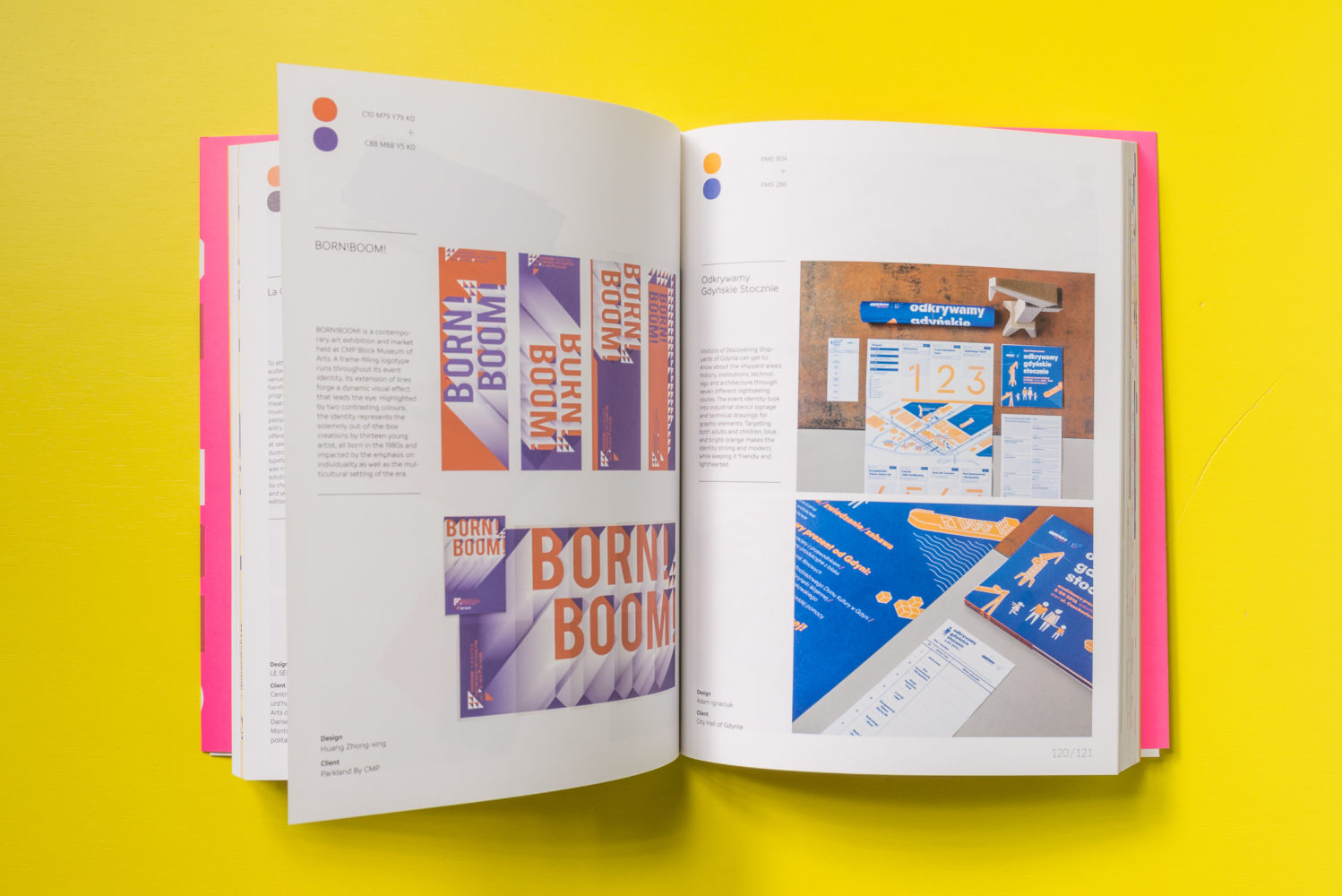
Not limited to social or political commentary, designers too have been utilizing these techniques for a wide variety of applications, from book design and packaging, to brand identity and promotion. Less is More examines the very best of recent graphic design in one, two and three colors.

